Ultimate Chart Template for PowerPoint

Need to turn business data into a presentation people can understand quickly? The Ultimate Chart Template for PowerPoint gives you a ready-to-edit library of more than 30 chart layouts and variations for comparing performance, showing trends, explaining proportions, and analyzing relationships. Replace the sample data with your own numbers, adjust the labels and colors, and build consistent slides without designing every chart from scratch.
Use the template for management reports, financial updates, sales reviews, market analysis, strategy decks, investor presentations, and executive dashboards. It covers the charts most teams use every week, along with specialized formats for more detailed business analysis.
30+ editable PowerPoint chart layouts and variations
The collection includes:
● Column, stacked column, 100% stacked column, and column-line combination charts
● Panel column charts for comparing several categories at once
● Bar, stacked bar, 100% stacked bar, and bar-line combination charts
● Line, stacked line, smoothed line, and panel line charts
● Line charts with average lines, date axes, and double axes
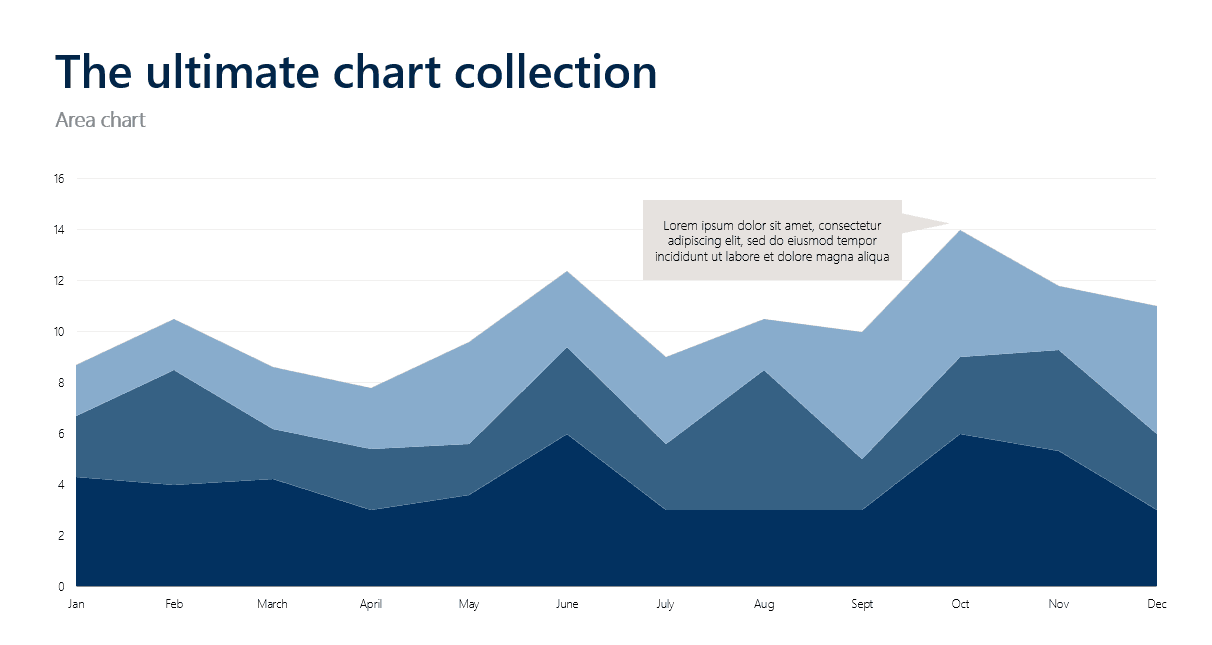
● Area, stacked area, 100% stacked area, and line-area combination charts
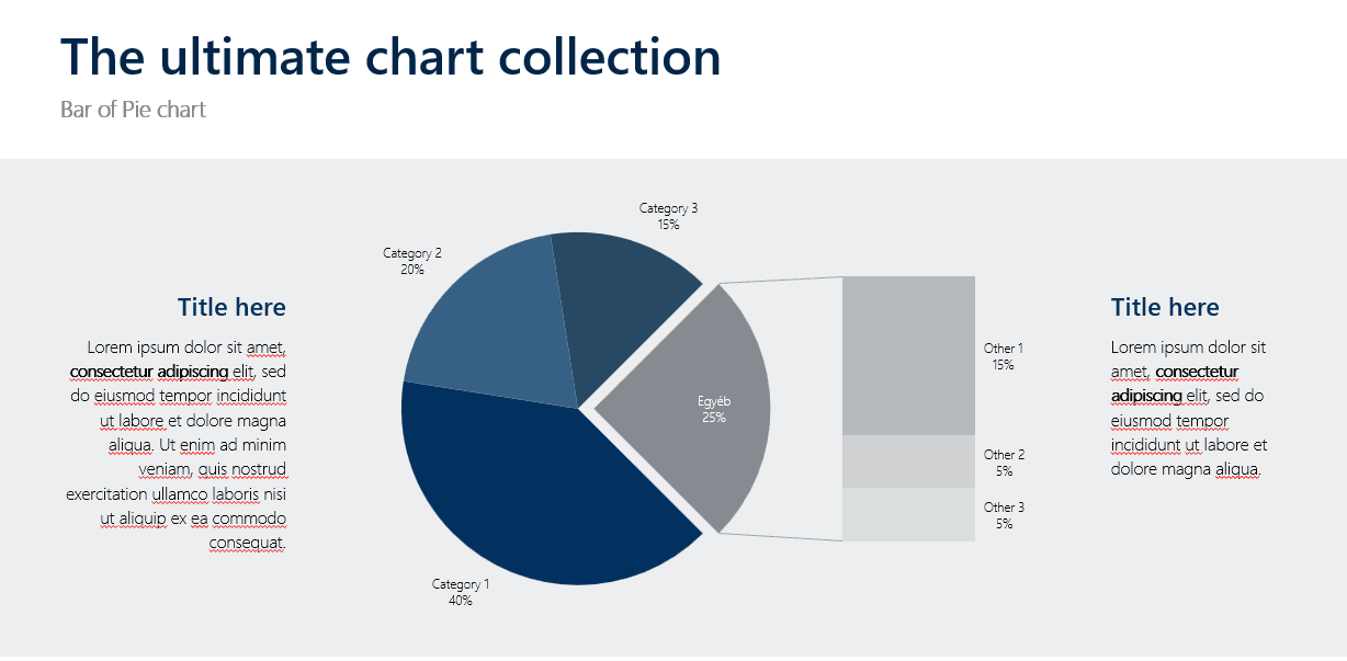
● Pie, pie-of-pie, bar-of-pie, and doughnut charts
● Standard, marker, and filled radar charts
● Scatter and bubble charts
● Waterfall and stacked waterfall charts
● Funnel, histogram, and box-and-whisker charts
● Treemap and sunburst charts
● Maps with data and map-and-pie chart combinations
Every layout is designed for PowerPoint and can be adapted to your data, presentation, and corporate identity. The collection is not just a list of chart types: it gives you multiple ways to present the same business question depending on the audience, data volume, and level of detail you need.
Which chart should you use?
Choosing a chart is easier when you start with the business question—not the data format. Use the guide below to select a practical chart type for your next slide.
Business question | Recommended chart | Best for | Avoid when |
How do categories, products, or regions compare? | Bar chart or column chart | Rankings and comparisons | There are too many categories to label clearly |
How is a total divided into components? | Stacked bar or stacked column chart | Contribution to a total | Exact comparison between every segment matters |
What share does each category represent? | 100% stacked chart, pie chart, or doughnut chart | Part-to-whole comparisons | There are many small or similarly sized categories |
How has a metric changed over time? | Line chart or area chart | Trends and movement | The categories are not time-based |
How do several measures move together over time? | Stacked line, panel line, or combination chart | Multiple time-based series | Too many series would create visual clutter |
How does performance compare with a target or reference point? | Line chart with a target, benchmark, or average line | Performance versus a reference | The reference value is not clearly defined |
How did a starting value reach its final result? | Waterfall chart | Profit and revenue bridges | You only need a simple category comparison |
How many leads, candidates, or customers remain at each stage? | Funnel chart | Pipeline and conversion stages | The stages are not sequential |
Are two variables related? | Scatter chart or bubble chart | Relationships and portfolio analysis | The dataset does not contain paired numeric values |
How are values distributed? | Histogram or box-and-whisker chart | Ranges, variation, and outliers | You only need to compare totals |
How does a hierarchy break down? | Treemap or sunburst chart | Nested categories and composition | There is no meaningful hierarchy |
How does performance vary by location? | Map or map-and-pie chart | Geographic comparisons | Location is incidental to the business question |
How do several attributes compare across the same subjects? | Radar chart | Multi-factor scorecards | There are too many variables or overlapping series |
The point is not to use the most sophisticated chart available. It is to choose the simplest chart that makes the intended comparison obvious.
Compare performance with bar, column, and combination charts
Bar and column charts are often the best starting point when your goal is to compare discrete categories. Use a column chart when you have a small number of categories and want to emphasize differences in magnitude. For a true time-based trend, a line chart is often the more natural choice. Choose a bar chart when category names are long or when you need to compare many items.
The stacked versions show how individual components contribute to a total—for example, revenue by product line, costs by department, or sales by customer segment. The 100% stacked versions focus on composition, making them useful for market share, channel mix, budget allocation, or survey results. If exact comparisons between individual segments matter, a grouped bar chart may be easier to read than a stacked chart.
Combination charts let you compare two related measures in one view. For example, show revenue as columns and margin as a line. This makes it easier to see when sales are growing but profitability is not keeping pace. The same approach can compare sales volume with conversion rate or headcount with productivity. Panel layouts are useful when you need to compare multiple regions, products, business units, or scenarios without creating one overcrowded chart.
Show trends and changes over time
Use a line chart when the main message is movement over time. The collection includes standard line charts for a single trend and stacked line charts for several contributing series. Use smoothed lines cautiously: they can make a chart look cleaner, but they may also hide meaningful changes in the underlying data. A panel line chart lets you show related trends in separate panels, which is often easier to read than placing every series on one crowded chart.
The line chart with date axis is suited to data recorded on specific dates, such as website traffic, campaign activity, customer volume, operational incidents, or financial performance. Line charts with average lines add a statistical reference, helping the audience see whether performance is above or below a typical level. If the real comparison is against a target, forecast, prior year, or industry benchmark, show that reference explicitly rather than treating the average as a substitute.
Area charts emphasize the scale of a trend. Use stacked area charts to show how several components contribute to a total over time, or 100% stacked area charts when the important question is how the composition changes. Line-area combination charts bring volume and movement together in one layout.
Explain proportions, relationships, and distributions
Pie, doughnut, pie-of-pie, and bar-of-pie charts are designed for part-to-whole comparisons. Use pie and doughnut charts only when you have a small number of clearly distinct categories. When precise comparisons matter — or when there are many categories — a bar chart is usually easier to read. Bar-of-pie layouts can help isolate smaller segments when a part-of-whole view is still the right choice.
Radar charts compare several attributes across the same subjects. They can support supplier evaluations, product comparisons, customer satisfaction studies, capability assessments, and strategic scorecards. Keep the number of variables and series under control: radar charts can become difficult to read when too many dimensions overlap. The collection includes standard radar charts, radar charts with markers, and filled radar charts.
Scatter charts show the relationship between two variables — for example, marketing spend and leads, price and demand, or revenue and employee count. A visible relationship does not necessarily mean that one variable causes the other. Bubble charts add a third variable through bubble size, making them useful for portfolio analysis and market mapping.
Histograms and box-and-whisker charts are useful when the audience needs to understand variation rather than just an average. Use them to show distribution, range, outliers, or differences between groups. Waterfall charts explain the individual increases and decreases behind a final number. For example, if EBITDA fell despite higher revenue, a waterfall can show the impact of pricing, volume, COGS, payroll, and other operating costs.
Advanced charts for business analysis
The collection also includes formats for hierarchical and geographic data. Use a treemap when you need to compare the relative size of many nested categories, such as a product portfolio or spend structure. Use a sunburst when the hierarchy itself matters and the audience needs to see how categories branch across multiple levels.
Map templates help present performance by country, region, territory, or location. Use a map when geographic distribution is part of the business question—not simply because the data contains locations. The map-and-pie layouts add composition data to the geographic view, so you can show not only where performance comes from but also how each location is divided.
These specialized charts are especially useful in consulting presentations, strategy reviews, market research, financial analysis, and executive reporting where a standard bar or line chart may not answer the full question.
Common chart mistakes to avoid
A strong chart is not only about selecting a chart type. It is also about removing distractions and making the comparison easy to follow. Keep these rules in mind:
● Do not use a pie chart for a long list of categories or nearly equal slices.
● Do not use 3D effects when accurate comparison matters.
● Do not use a dual axis unless the relationship between the two measures is clear and defensible.
● Do not use a stacked chart when the audience needs to compare every segment precisely.
● Do not smooth a line unless the visual treatment supports the message and does not hide meaningful changes.
● Do not use color as decoration. Assign color a clear meaning, such as actual versus forecast or positive versus negative.
● Do not place every available metric on one slide. One chart should usually have one main job.
Start with the message, choose the chart that supports it, and remove anything that does not help the audience reach the intended conclusion.

What makes this chart template useful?
The main benefit is not simply that the file contains many chart formats. It gives you a reusable visual system for recurring presentation work.
● Save time: start with a structured layout instead of rebuilding charts from a blank slide.
● Improve consistency: use a coherent approach across reports, dashboards, and executive decks.
● Work faster under deadline: adapt an existing chart when a meeting or client request changes at short notice.
● Support better storytelling: match the chart to the business question instead of forcing every dataset into the same format.
● Brand the presentation: adjust colors, labels, titles, and other editable elements to fit your corporate identity.
The download gives you editable building blocks for standard reporting and more specialized analysis. Use a simple chart for an executive summary, a panel layout for a detailed comparison, or a combination chart when two related measures need to be shown together.
Who is this chart template for?
The Ultimate Chart Template is designed for business professionals who work with data in PowerPoint, including:
● Finance and analytics teams preparing reports and forecasts
● Sales and marketing teams reviewing performance and conversion
● Consultants creating client-ready business presentations
● Strategy teams explaining markets, portfolios, and business drivers
● Managers and leadership teams preparing KPI, operational, or board updates
It is useful when you need one chart for an upcoming meeting and when you are building a larger presentation with multiple data stories.
Download the Ultimate Chart Template
Stop rebuilding the same charts for every presentation. The Ultimate Chart Template for PowerPoint gives you a ready-made chart library you can adapt to your own data, brand, and audience.
Build polished business charts faster, keep your presentations visually consistent, and adapt the same layouts to different reports, clients, and audiences. The download includes more than 30 editable chart layouts and variations for comparing categories, tracking trends, showing proportions, analyzing relationships, and explaining business drivers. Use them across reports, pitch decks, workshops, management presentations, and executive reviews.
Explore our full library of instantly downloadable presentation templates.
Please note: We are currently updating some download links. The templates themselves are ready to use. If you need a file immediately, contact us, and we will send it to you directly.
Related presentation templates
👉 Financial Reporting Template
For the broadest toolkit, get the complete presentation template collection in one comprehensive bundle.
Need a custom presentation?
A ready-made chart template is useful when you need editable slides quickly. If your presentation also requires a custom structure, branded design, or a complete pitch deck, Pitch Experts can create a tailored solution for your company, sales team, leadership group, or client project.
Contact us to discuss a presentation built around your audience, message, and visual identity.